English
Charts & Tables
Charts
Insert data visualizations directly on your slides.
- Click the Chart button in the toolbar.
- A chart element appears. Double-click to edit the data.
- Choose the chart type: Bar, Line, Pie, or Doughnut.
- Edit labels and datasets in the data table.
- Click Apply.
Charts are rendered with Chart.js and update live as you change the data.
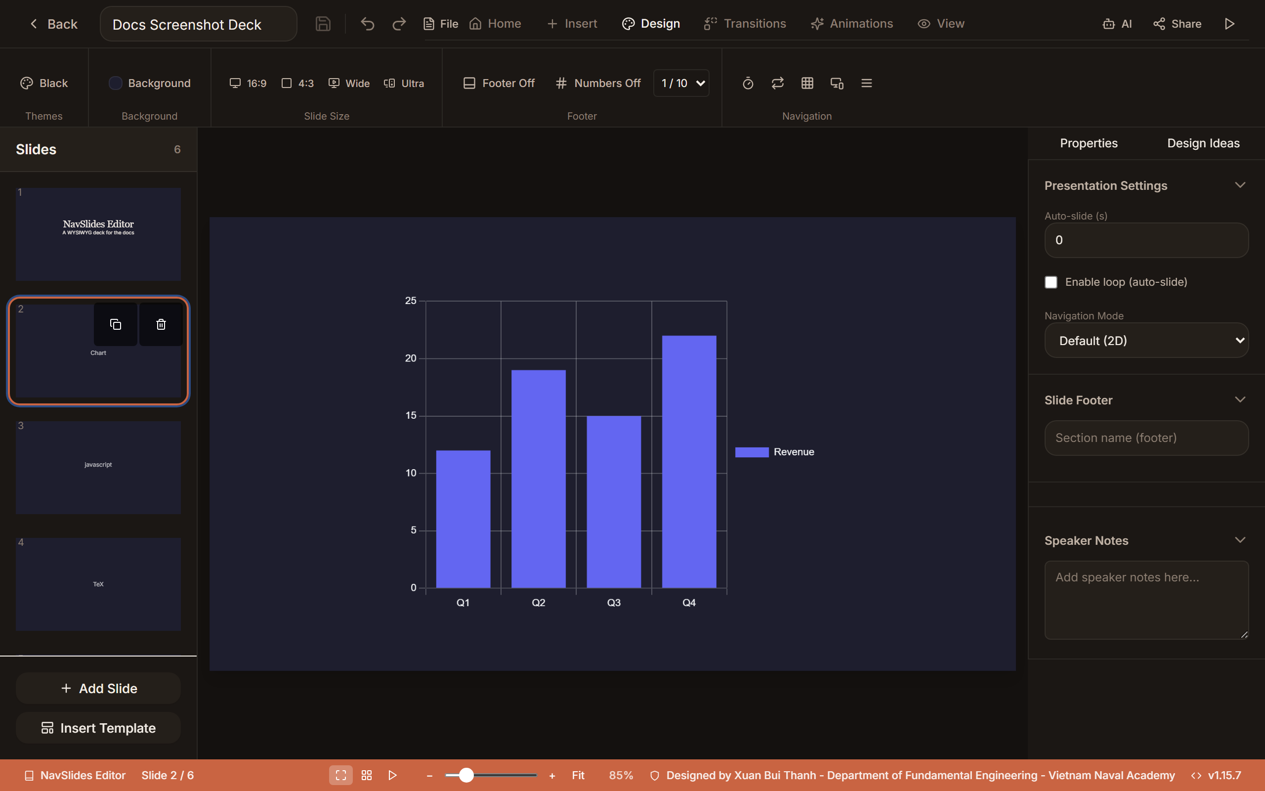
Example output
Tables
- Click the Table button in the toolbar.
- A table element appears with default dimensions. Double-click to edit.
- Click any cell to type content.
- In the right panel, configure:
- Rows / Columns — add or remove
- Header row — toggle header styling
- Colors — header background, cell background, border color, text color
- Font size and cell padding